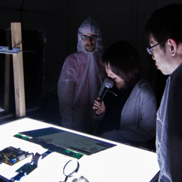
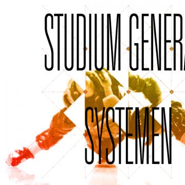
Link: Jakob in Hong Kong & The Final Project
Link: Jakob in Hong Kong + The Final Project
Link: Jakob in Hong Kong / The Final Project
Link: Jakob in Hong Kong . The Final Project
Link: Jakob in Hong Kong = The Final Project

PIPS:lab Internship


What is this?: Blog


Year: 2012


Three months that changed my view on Design and how I want to be part of it.

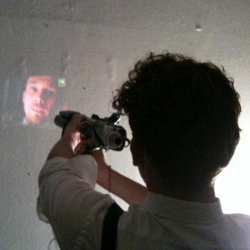
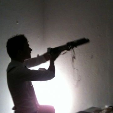
On my blog I documented my journey. Crazy, and so nice.

And yes, they hired me as a graphic artist when internshipping was over.

get here to the blog

get more info about this project

the great commentator

What is this?: online pdf annotation tool

Year: 2013

The great commentator enables you to draw into and comment pdfs at the same time together with your friends/colleagues/anyone.

get more info about this project

the next thing that happened to writing (or the death of the emoticon)


What is this?: Everything, my final project


Year: 2013


This is my prophecy for future writing. I developed intuitive tools to give emotional information to lettershapes in realtime. So, for example you can use the tone of your voice or body movement to visually modify text. As a foundation of this prediction I analysed writing from its beginning until now and visualized the evolution of lettershapes in 3 dimensional sculptures. With my project I want to show that there is a huge potential for writing in new media, and it is still to be explored.

Death to all emoticons. I hate them. If I watch people using them, they often wear cold, grumpy stone faces while letting a laughing yellow face roll around the screen. I think that this is stupid and I believe that with new media type itself can be used as a carrier of emotional information and that is, of course much more exciting. When new media will be fully understood and used properly, it is going to be amazing. And even if several experts think differently, I predict a blooming future of writing. But before I could make this prediction I wanted to really know what I am talking about. So I looked at how the Chinese and Latin Script behaved from their point of invention until now, just to get a solid foundation for my prophecy. I was very much interested in the evolution of shape and its relation to media, tools and social environment. To embody this evolution I created 3 dimensional sculptures, which makes sense since a lettershape has two dimensions and leaves the third available for time. The three dimensional space we live in is therefore perfect for my purposes: the visualization of the evolution of letter shapes throughout time in 3dimensional sculptures. I looked for a system or pattern throughout the years which I can then apply to modern media.

These findings I extrapolated into experiment and prophecy. Because I believe that now is the time to make as many experiments as possible to explore the potential of new media. That's why the length of our communicating texts will be shorter, while the expressiveness of what we want to share becomes even greater. The shapes of letters are definitely expressive enough to be able to communicate the whole mélange of human emotions. We just need a good and intuitive interface. Looking for this, I developed ways of controlling letter shapes with body movement and the voice. Then you can bring a great variety of emotion in text without having to design, or even think about it. My programs analyze audio and image and translate them directly into lettershapes. When you're angry, your text is angry. When you're sad, the text is too. You could even recognize your friends by their lettershapes. My research and experiments shows us that a new kind of dynamic typography is not only possible, but a logical and inevitable step. And emoticons.. well.. you can forget about them.

get more info about this project

the illusion of success


What is this?: A small book


Year: 2011


typographic approach about the optical illusion. Deeper meaning: There is a deeper meaning. Sure. Promise. Illusion of success. Breaking necks. Nicely visualized.

get more info about this project

nieuwe vragen / new questions


What is this?: Festival Posters


Year: 2011


Academywide Festival that kicked off the year 2011. I was allowed to do all posters, flyers, web, blablabla, very nice!!!!
These are the posters I designed. They were 16 different posters, especially designed for the place where they were put. This way, a symbiosis with the building was accomplished, as well as a distinguishing factor from other posters.

get more info about this project

nieuwe vragen / new questions


What is this?: Festival Logo


Year: 2011


Academywide Festival that kicked off the year 2011. We were allowed to do all posters, flyers, web, blablabla, very nice!!!!
This is the Logo we designed for the identity. The font we used for the logo was based on the shape of the questionmark. Obviously, this way we wanted to refer to the name of the festival, and create a nicely weird effect.

get more info about this project

users intelligence don't merge but intersect


What is this?: Interactive Media Design


Year: 2011


Thoughts about usability

get more info about this project

jakob is the magician


What is this?: introduction video


Year: 2011


Jakob introduces himself and defines his relationship with graphic design.

get more info about this project

laser von der vogelweide


What is this?: Letter & Logodesign


Year: 2011


There was once formed a band called Laser von der Vogelweide membered by Boris König, Moritz Schlötter, Tom Vermaaten & Jakob Schlötter. Obviously it needed a logo. Thanks to his glorious reputation the man called jakob was asked to do the job. Inspired by the trinity, he designed a three-hooked-typeface arranged in a three dimensional Möbius-Triangle.

get more info about this project

nieuwe vragen / new questions


What is this?: Festival Digital Stuff


Year: 2011


This is the digital part of the nieuwe vragen / new questions projects. It includes mailbomb, several animated gifs to include on websites and a rainbow unicorn.

By the way, the e-mail invitation is the first thing I did for this project, and features the first dr. frankenstein. He resembles the scientific aspect of artistic research - as may expected - impressively striking.

get more info about this project

daily gozilla


What is this?: Illustration


Year: 2010


The impression of Gozillas daily life

get more info about this project

The Next Thing That Ever Happens


What is this?: Essay


Year: 2013


Could this be a manifest? Maybe, yes. Possibly something like that.

get more info about this project

Beamergun


What is this?: tool


Year: 2012


We all like to see our faces, so why not develop a gun that shoots your face everywhere? Possibly also on the face of the person you're talking to right now. Brilliant?

get more info about this project

Studium Generale Trailer I


What is this?: Animated Poster


Year: 2010


Every week we had lectures from external artists or researchers. They were free to attend for everyone and academywide (Studium Generale). I was asked to make an animation to promote these events. The animation was beamed on several places inside the Academy and changed every week. The background shapes and images were always based on the works of the artists, and sometimes an interlude or additional short animation was shown to keep the thing interesting. The durance of this project was one semester. I was then asked to make the animations for the second part of the Studium Generale as well, what resulted in another set off videos. More about them later.

get more info about this project